What is Accessible Online Learning?
These are online training products that are designed and developed so that people with disability can use them; they can perceive, understand, navigate, and interact with the training products.
Accessibility is NOT usability. Usability refers to the learner’s experience of the online training.
There are a range of ways that accessible online learning functions can provide a solution to accessibility problems. Disabilities are diverse, so obviously there needs to be diversity in solutions.
Some key elements of accessible online learning are;
Making your course Keyboard Accessible
This means making every activity, object and element of your online course keyboard accessible. By doing this, people who can’t use a mouse can still interact with all elements of the training.
Once your course is keyboard accessible, it will work with common assistive technology (AT) such as screen readers, which identify and interpret what’s on the screen and then present it to learners using text-to-speech, sound icons, or braille output devices. It will also work with Make Your Course Keyboard Accessible 6 mobility-assistive devices such as keyboard overlays that make it easier for people with motor control difficulties to type.
Providing Alternative Text
Screen readers use Alt Text in the place of objects, so accessible online courses should provide concise and descriptive Alt Text on all relevant elements.
Alt Text should convey the same content and information presented on the object or image.

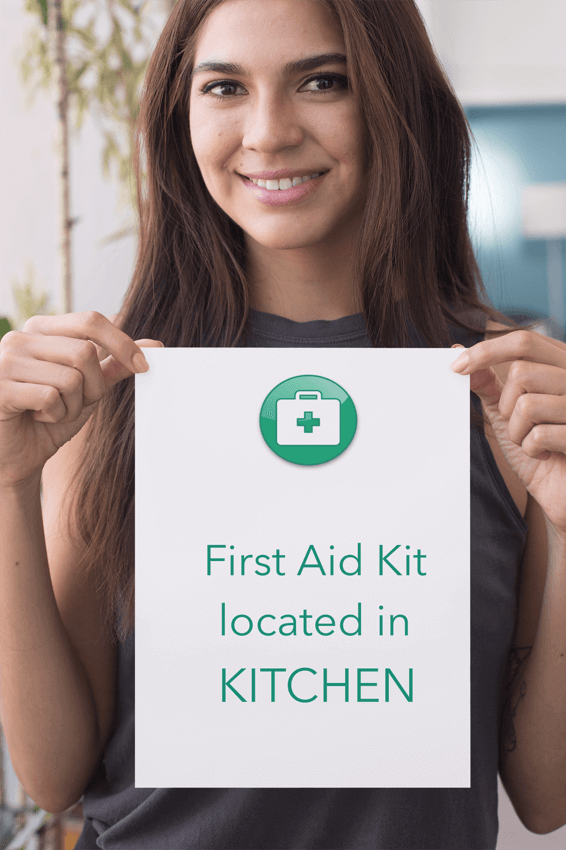
Here’s an example of why it is important . . .
In an employee induction course, letting new employees know where to find the first aid kit is important. If this image was used and there was NO Alt Text enabled, some people would miss this important information.
When creating accessible online learning, your instructional designer should look at each element of the training and identify what information is needed in Alt Text to provide concise information in a way that gets the best results for the learner. Some elements will need to be more descriptive than others.
Ordering of Objects and Text
Vision impaired learners tab through objects on a slide from left to right, top to bottom, so accessible online learning products will order objects and text on the slide in the same way.
For example, for a quiz slide, make sure that learners tab first to a question, then directly to the answer choices in sequence. It would be confusing to hear the answers before the questions.
Create Usable Navigation
Your course should create a positive navigation experience for learners with disability. This means removing or being able to easily disable persistent navigation objects, such as side menus that list every training slide. These menus are great for most learners, however, imagine being vision impaired and you had to listen to every menu item every time you moved to a new slide. That’s not going to work.
Including Hot Keys in another way to help vision impaired learners navigate through your online training course.
Make Audio and Video accessible to everyone
Again, the rule is that your training elements convey the same information to all learners.
Ways to do this;
- Use captions with audio and video
- Provide text transcripts of audio and video
- Provide audio transcripts of videos
- For high-process orientated videos, provide a job aid document that lists the step-by-step process in detail
- Provide alterative options for accessing information. This can be a great option for not only people with disability, but for people with different learning styles. If given the choice, some people prefer learning via reading text and some prefer to watch a video – so provide the choice where ever possible.
It is also recommended that instead of having auto-starting videos, that you include a video control bar so learners can start, stop, pause and rewind the training.
Using Colour
Don’t rely on colour alone to convey meaning. This is a big learning for me as I’m a very visual person. To me, green means “correct” or “start” and red means “incorrect” or “stop”. However if a colour-blind learner can’t differentiate between the two colours, then they have no meaning. Therefore accessible online training will ensure that if the course were accessed in grey-scale, it would still work.
As colour can be impactful for dyslexic learners, keep the text high contrasting, however, avoid a white background; go for a cream colour instead. Also avoid red, pink or green.
Why would you include Accessible Online Learning products in your employee's training library?
There are approximately 4.4 million Australians who live with disability – that is one in six people. In fact, as people with disabilities such as dyslexia and colour blindness don’t always identify, the number is probably higher.
By providing employee training content that is accessible to more people, you are being inclusive and you are opening up your hiring potential. While you may not currently have employees with disability, this doesn’t mean that the best person for your next hire won’t have disability.
Ensuring your online training is accessible also sends a message to your team about the company’s commitment to diversity and inclusion.
Another reason maybe that you are working within a Government contract and need to be compliant with WCAG requirements (Web Content Accessibility Guidelines).
Can TANDI create accessible online learning content?
ABSOLUTELY!
When planning your next online course, CONTACT US to discuss how we can create a course that considers the needs of people with visual, auditory, or mobility disabilities.
Important note : it is far easier to include accessibility functionality when it is considered in the design phase, rather than trying to update your existing training.
